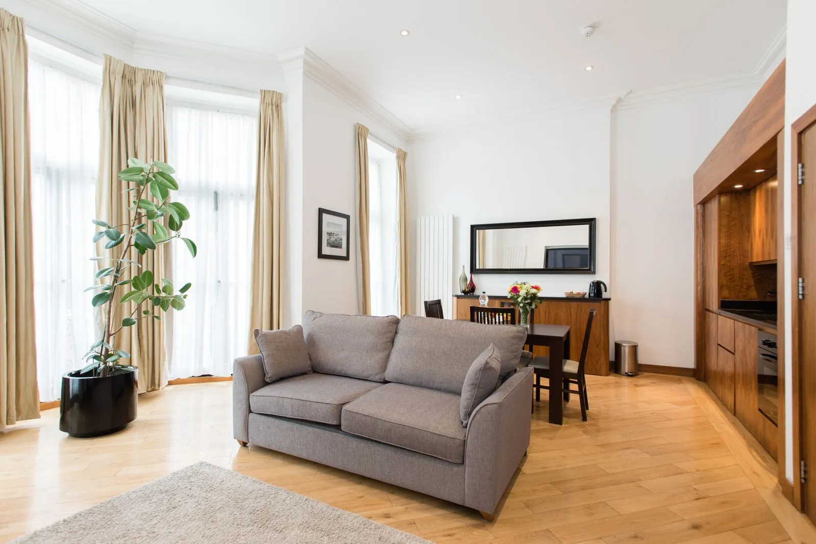
A paint colour rarely looks exactly the same on a sample card as it does on a wall. In London homes, changing daylight, window direction, neighboring buildings, and traditional finishes can all influence how a shade appears. Start by looking closely at the room you have, rather than choosing a colour in isolation. With a few simple checks and well-placed samples, you can build a palette that feels balanced throughout the day and works with the details you plan to keep.
Read the room’s natural light
Notice how daylight moves through the room before selecting paint. A room with large, unobstructed windows may feel bright for much of the day, while a lower-ground space or a room shaded by nearby buildings may receive less direct light. Check the walls in the morning, midday, and evening; the same shade can shift from crisp to muted as the light changes.
Artificial lighting matters, too. Warm-toned bulbs can make some whites and neutrals look creamier, while cooler bulbs may make them feel sharper. View paint samples with the lights you normally use, as well as in daylight. If a room relies on lamps after dark, choose a shade that still feels comfortable under that lighting rather than judging it only beside a window.
Use orientation as a guide
North-facing rooms tend to receive cooler, more indirect light. Warm whites, soft pinks, or earthy neutrals can help them feel welcoming, while a cool gray may appear more subdued than expected. This does not mean you must avoid cooler colours; test them in the room and consider whether you want a calm, shaded effect or a warmer overall feel.
South-facing rooms usually receive stronger, warmer daylight, which can make colours appear more vivid. East-facing rooms get brighter morning light that changes as the day goes on, while west-facing rooms often feel warmer later in the afternoon. Treat orientation as a starting point, not a rule: window size, glazing, trees, and surrounding buildings also affect the light.
Work with existing finishes
Look at the finishes that will remain: flooring, brickwork, tiles, stone, woodwork, kitchen units, and large pieces of furniture. Identify their underlying tones. A pale floor may lean yellow, pink, or gray; a timber feature may look warmer or cooler beside different wall colours. Choose a paint sample next to these materials so you can see whether the combination feels intentional.
Use a few repeated colours to help rooms connect, especially when doorways make several spaces visible at once. You might carry a warm neutral through a hall and adjust the depth in adjoining rooms, or repeat a muted accent in smaller details. Consider the colour of trim and ceilings alongside the walls; changing all three at once can make it harder to judge what is working.
Test before you commit
Paint sample boards rather than relying on small cards. Make each board large enough to judge at a glance, then move it between walls and place it beside the room’s fixed finishes. If you apply samples directly to a wall, use separate areas and enough coverage to see the colour clearly. Check each sample at different times of day and under evening lighting.
Compare only a few shades at once. Too many nearby options can make subtle differences difficult to see. Note what you like and dislike about each one: does it feel too cool beside the floor, too bright in afternoon sun, or too dark away from the window? Once a shade works in the room’s actual conditions, check the manufacturer’s guidance for the finish that suits the surface and its use.
The most dependable paint choice comes from observing your light, understanding the room’s orientation, and testing colour beside the finishes you already have. Take time to view samples across the day before ordering paint or starting work. If you would like help bringing a London home’s palette together, Stillroom Interiors can discuss your project.